WORDS / ANURAG SHARMA
Place is more than a visual reference. It is light, climate, material, language, movement, and the way people gather. When a brand begins with those conditions, its identity can feel rooted without turning heritage into decoration.
The first step is observation. Look at how shade changes a space, how local materials age, and which forms people already recognise. These details reveal principles—rhythm, openness, contrast, restraint—that can guide a modern system.
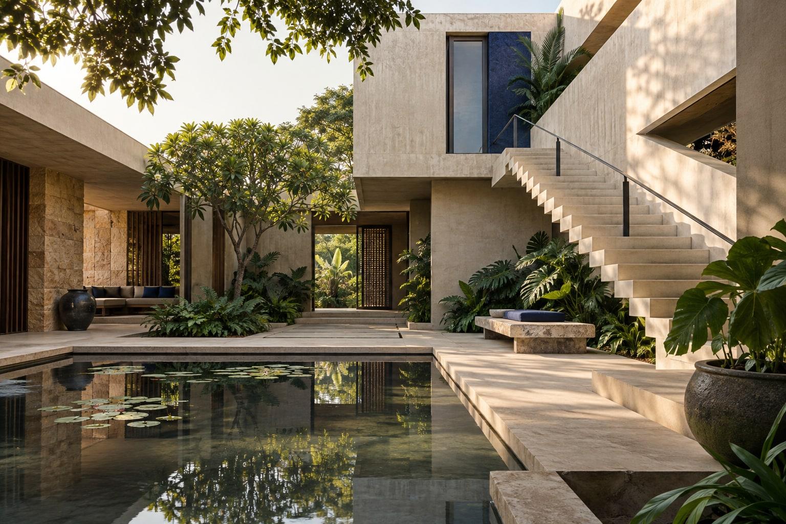
Translation matters more than imitation. A carved pattern might become a spacing rule. A courtyard might inspire a flexible layout with a strong centre and breathing room. A regional colour can become an accent rather than a costume.
Digital products add another test: the system has to remain clear at small sizes, in motion, and across changing content. Typography, navigation, and interaction should carry the same sense of place as the identity without making the experience harder to use.
The result should feel specific and current. The work remembers where it comes from, while giving the organisation enough range to move forward.
Let’s put an idea to work ↗